Featured

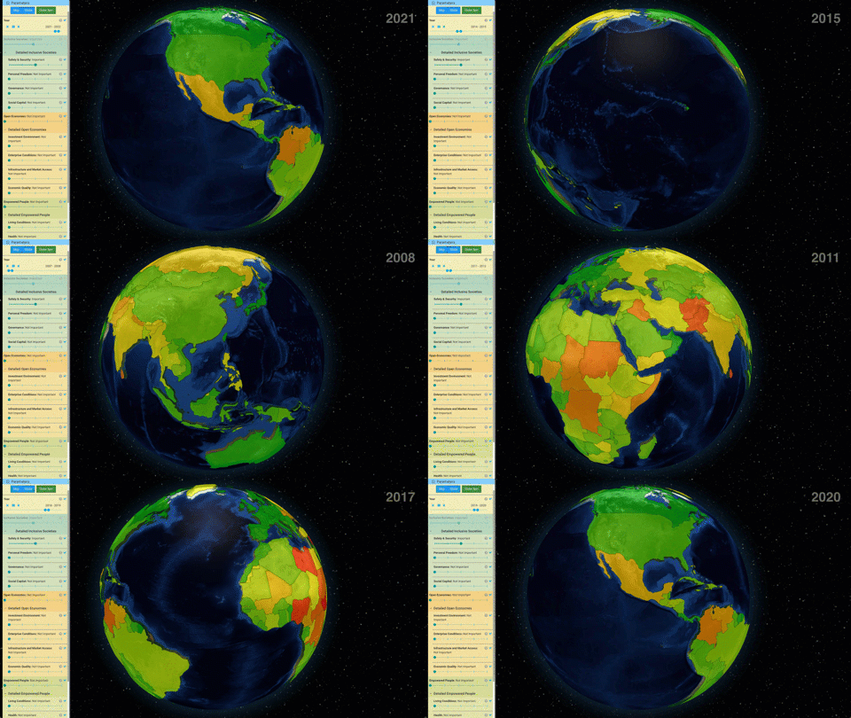
World Prosperity
Based on ten years of daily GHCN data, it is too cold, too hot, and too wet out there.
Histograms shown with color intensity behind a line showing the average show how the distribution has changed over time.
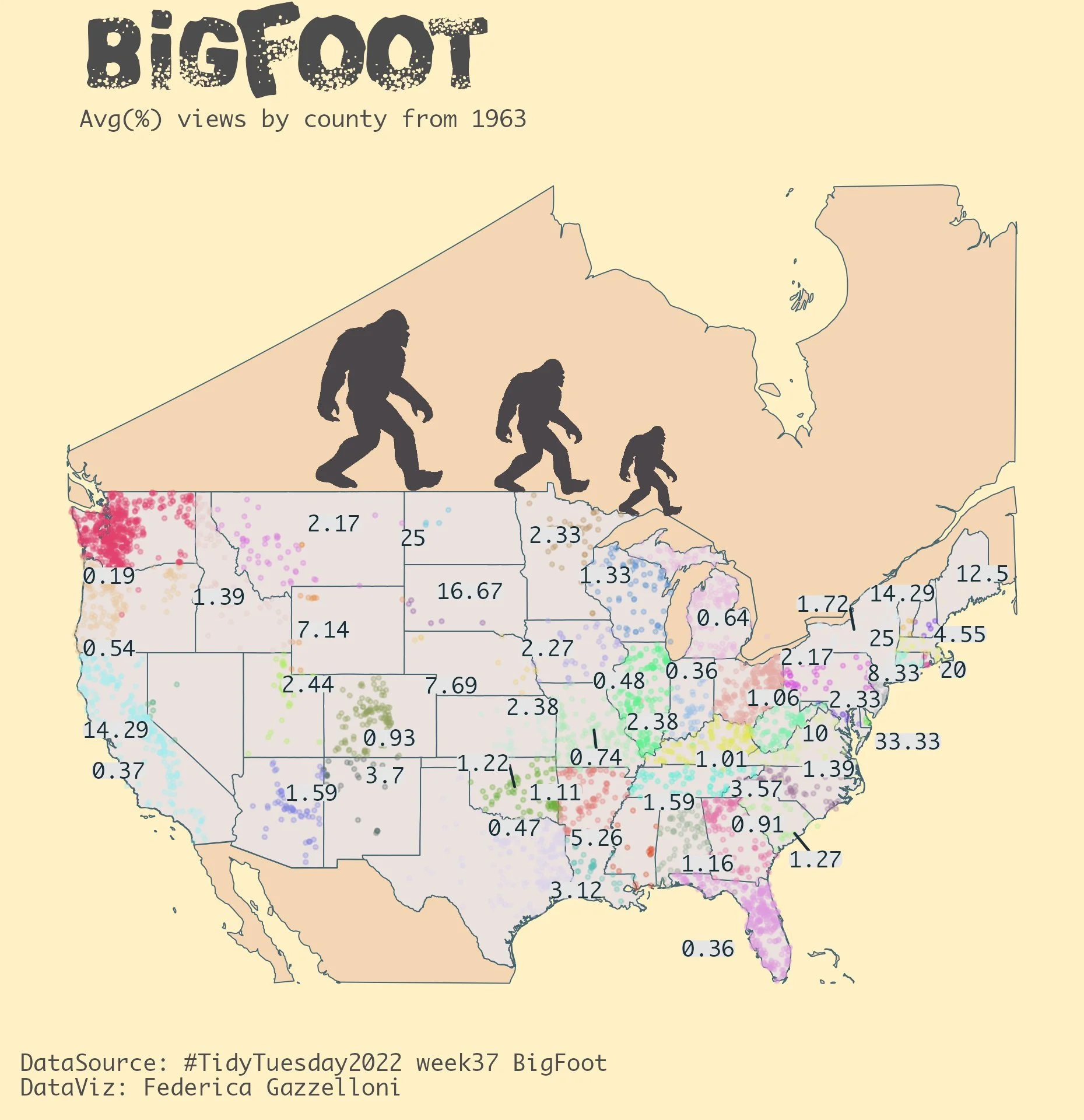
Check out four different ways to plot geographic data (in Excel).
How do low teacher salaries and high housing costs influence access to high-quality teaching?
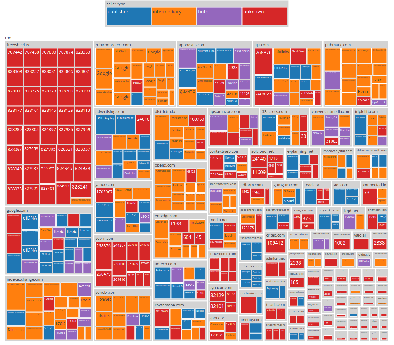
The most popular technology terms in job listings for machine learning engineers


